

Actual Size: The Seventh Dalhousie Drawing Exhibition (review), ArtsAtlantic, 20, Summer 1984.
Dalhousie Art Gallery, Halifax, 1 March–8 April, 1984.
I
Following on the heels of the 30th Annual Dalhousie Student, Staff, Faculty and Alumni Exhibition, the Seventh Dalhousie Drawing Exhibition comes as a kind of postscript to the former and could more accurately be titled “The Nova Scotia College of Art and Design Ex-Faculty and Alumni Exhibition.” This because, out of the many reasons offered by guest-curator Robert Berlind in his catalogue introduction for bringing together this particular selection of works, the only one which doesn’t require an heroic leap of faith to believe is that “all of the artists in the show and the curator as well have spent time at the Nova Scotia College of Art and Design in Halifax either as full time faculty (Fischl, Jarden, Schor, Tucker, and myself), as visiting artists (Ewen and McEwen), or as students (Jarden and McPhee).”
Add to this the fact that, over the past four years, Dalhousie Art Gallery has not exhibited (except for one or two pieces from the permanent collection and the current Colville show) a single work by a contemporary Maritime artist who is not connected directly with NSCAD, and one can recognize the truth in Berlind’s contention that certain longitudinal “cultural frontiers” exist that are more significant than the geographical border between the United States and Canada.
My own contention is that one of these “significant frontiers” has been established in Halifax by the Nova Scotia College of Art and Design and Dalhousie Art Gallery. It is called Barrington Street, and it separates the academy from the organic creativity of a community and a region.
II
In 1979, when I was the acting curator of the Dalhousie Art Gallery, due to lack of funds I curated the Fourth Dalhousie Drawing Exhibition and selected work by six Nova Scotian artists. This was then and still is the only drawing exhibition of the seven to be refused a Canada Council grant to institutions. The reason given was that all the artists I had chosen, with the exception of Alex Colville, were unworthy. I was also instructed that Dalhousie Art Gallery should, in future, exhibit only work from outside the Maritime region.
However, I proceeded with the Nova Scotian drawings and the attendance figure for the exhibition was 1,824 visitors, compared, for example, to 808 for the second and 999 for the sixth exhibition. These are the only other drawing exhibitions I can find attendance figures for, but I am certain they are representative.
Such evidence demonstrates that, by fostering an elitism which is not determined by quality, and that identifies with an away-team, Dalhousie Art Gallery discourages community and university gallery-goers. The worst result is the destructive consequences suffered by the creative life of a community when its indigenous art is neglected and its artists feel humiliated and discouraged on their home territory.
III
The success of the Fourth Dalhousie Drawing Exhibition is understandable. Not only were the artists related to the same community as the gallery visitors, but the works which had been promoted as drawings really were drawings—pencil, pen and ink, conté, pastel and charcoal—two-dimensional and of a comprehensible size. The audience at least got what it expected.
The first and third exhibitions were also selections of work which, by common convention, we call drawings, but the second, fifth, and now the seventh have gotten derailed somewhere in Alice’s looking-glass world where the preposterous Humpty Dumpty proclaims, “When I use a word, it means just what I choose it to mean, neither more nor less.” And the word “drawing” has undergone so many putative semantic changes and extensions that it has come to mean, equally, photography, painting, sculpture, installation, performance and even, on occasion, drawing.
“‘The question is,’ said Alice, ‘whether you can make words mean so many different things.’ ‘The question is,’ said Humpty Dumpty, ‘which is to be master—that’s all! ... When I make a word do a lot of work like that, I always pay it extra.’” And that’s where the Canada Council comes to the rescue—chequebook in hand.
IV
But what about the price paid in the other direction, not to the gallery but by the gallery, the artists whose work is being shown, and the work itself, to this kind of curatorial permissiveness?
Suppose that I go into a restaurant and order a piece of chocolate cake and the waitress brings me a piece of apple pie with a fancy explanation of how apple pie really is chocolate cake and the manager just happens to know a pastry cook who makes the best apple pie in town and how I must eat apple pie as if it were really chocolate cake? Even if this is the best apple pie in the whole of North America, assuming I had my heart set on a piece of chocolate cake, I’m not going to be very favourably disposed toward that pie. I would probably dislike it—as well as the waitress, the pastry cook, the manager and the restaurant.
Of course the main victim in this little episode is that delicious and innocent piece of pie that was made to impersonate chocolate cake. Because in this situation no amount of rationalizing could persuade me to appreciate it for itself.
V
And this brings me finally to the Seventh Dalhousie Drawing Exhibition, which consists of sixteen works of which at least eleven are apple pie.
John McEwen shows steel sculpture, Mira Schor mixed media sculpture, Patterson Ewen paintings, and Richards Jarden works made by a laminated wax technique. Three black and white oil paintings on paper by Medrie McPhee can probably pass as tonal drawings, and Eric Fischl’s oil on glassine paper, Bathers, has the graphic impact of calligraphic drawing. William Tucker’s gargantuan 16 x 16 ft. charcoal on paper study for sculpture is the only work exhibited which can not be described as something other than a drawing.
If one comes to the gallery hoping to see drawings, he or she will have a disappointing experience and a puzzling one, for although the sundry justifications in the catalogue for these works being regarded as drawings read like elegantly argued legal briefs, they fail to exonerate such posturings. It is embarrassing to think that the organizers of these shows are so naïve as to harbour vainglorious hopes of redefining, in a scholarly way, the activity of drawing. Yet why make a tradition of flaky etymology and misconceived apologetics by persisting in mounting these mongrel exhibitions?
VI
Individually, these works are strong, well-realized statements. Patterson Ewen’s raw plywood surfaces are physically satisfying expressions that reject all concern for preciousness and subtlety. His intentionally elementary methods, which relate more to rough carpentry than to studio painting, produce accurate metaphors for the frontier lands and spaces of the paintings.
Medrie MacPhee is concerned with a different kind of space. Her large black and white paintings of the impersonal furniture of the city, such as escalators and revolving doors, are invested with subjective power by the use of light and shade. This tonal rendering puts emphasis on spatial illusion which suggests physical sensations and psychological ambience. These images evoke experience through architectural description, and they owe a large debt to Edward Hopper’s paintings of the city—from inside and out—in which light is the major dynamic element of both pictorial and narrative content.
The art of Richards Jarden is something like embroidering or weaving a television image with wax. By laminating extremely thin strips of coloured wax, he reproduces simultaneously the picture and the lines of the TV screen. Quite apart from their heavy dependency on an elaborate conceptual rationale and the quaint and tedious process employed in their manufacture, they have a visual fascination and beauty of their own. The pure waxy colours of the images and the soft, translucent white of the spaces between create a textural but surreal sensation, not unlike what one might imagined would be evoked by soft ice or brittle clouds.
Mira Schor’s mixed-media sculptures are expressions of an inward vision. Figurative and feminine, these objects, which are about five feet high, are shaped by layering and rolling rice paper, which has been given a gritty surface texture with various materials such as dry pigment, graphite, oil stick and pastel, with chicken wire and plaster. In colour and shape they suggest organic imagery like pods (I think immediately of milkweed) or cocoons, and have vertical slits or envelope-like openings that expose precious and surreptitious contents of matter and psyche.
Teko (with Broken Base) by John McEwen is the life-size image of a wolf—flame-cut from a four-inch-thick steel plate and mounted on a long two-part base of steel 2 x 4. Best viewed in lateral silhouette, the animal is a very liberal representation. Through his economy of method, McEwen has found an exacting analogue for the fierceness and natural elegance of the wild beast. To activate its full narration potential, this work requires a propitious installation and, seen here in isolation against the white gallery wall, it takes on a lovely poetic presence.
The enormous charcoal drawing by William Tucker is essentially a full-scale plan for his sculpture Rim. Originally made to help visualize a projected work, it has obviously been prettied up with additions of subtle background textures and coarse gestural eraser marks for exhibition purposes. The circular image exploits an archaic simplicity of geometric form and expresses, through a nearly mechanical control of execution, the ideological convictions of classicism. It depends on measurement and precision, which in turn clarify concepts based on the didactic purposes of express structure. There is a powerful static vitality in this handsome drawing which just might emanate a more commanding presence than the sculpture it illustrates.
Whereas a contour drawing like Tucker’s idealizes its subject, Eric Fischl’s calligraphic gestures work through spontaneity and speed and tend toward characterization. His creative persona intrudes and dramatizes the act of drawing—an egocentric posture which derives historically from the Baroque/Romantic/Expressionist traditions. Bathers is a group of six life-size figures under the shower. They are executed rather untidily with a large brush and black oil paint on ten separate sheets of unframed glassine (transparent) paper which can be moved about on the wall to vary their positions within the group.
This is an inventive and facile method for developing narrative—especially Fischl’s kind of story-telling which relies on compositional devices and formal relationships for its psychological impact. I am reminded of Cézanne’s great series of bather paintings and the endless variations he made before he found a satisfactory compositional solution.
VII
In commenting, however briefly, on these works, I have tried to keep in mind the fact that laying words on visual objects and dumping verbal theories in their paths can do them a grave disservice. It is an alarming sign of the times that we need not believe in language as a means of communication. But to engage in the kind of free play with words that extends the meaning of “to draw” to include “to paint,” “to cut,” and so on, is an example of just how powerfully this permissiveness works at cross-purposes with the intention to clarify and describe.
It is ironical that, in spite of the effusive rationalizations offered up in the catalogue one discovers, after the smoke has cleared, that what these works of vastly different intention and creative means really have in common is a visual clarity and directness which is open and available. Seen on their own terms, they don’t need elaborate theories to be understood. And they don’t deserve to be distorted by abstruse theories that force them to conform to the requirements of something they are not.
VIII
In practice, I suppose, these concerns are unimportant, because most gallery-goers don’t bother to read this type of lengthy catalogue essay. If they want literature they will go to the library.
They go to an art gallery to see, and they go to a drawing exhibition to see specific things that can only—or at least best—be seen in drawings.
Because of the great diversity of graphic media and the profusion of subjects and techniques available to the draughtsman, a good drawing exhibition can be one of the richest and most rewarding experiences an art lover can have. There is often a special eloquence in the process and range of effects in drawings, due to their capacity to represent the flash of sensation, or rapid and fragmentary suggestion.
They can be tools for the exploration and formalizing of contemporary feelings, and vehicles that make entertaining use of spontaneity, lightness, and wit. On the other hand, they can express a ponderous tonal formality, sombre, moody deliberation, detailed thoroughness, or classical precision and restraint. The expressive possibilities are endless. And even in a period when the intimacy of drawing has fallen out of fashion, they are there in the studio closet waiting to be called forth by a change of times.
To specialize rather than extend the definition of drawing might be an effective way of attributing fresh values to the activity, before it is deconstructed forever.
Carol Fraser.
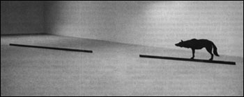
John McEwen, Teko (with Broken Base), 1980. Flame-cut steel